
Google has officially rolled out the new Play Store design to users across all Android devices. The new design features a complete visual redesign aligning with a Material design language and introduces several user-facing updates to deliver a cleaner, more premium store that improves app discovery and accessibility for the users.

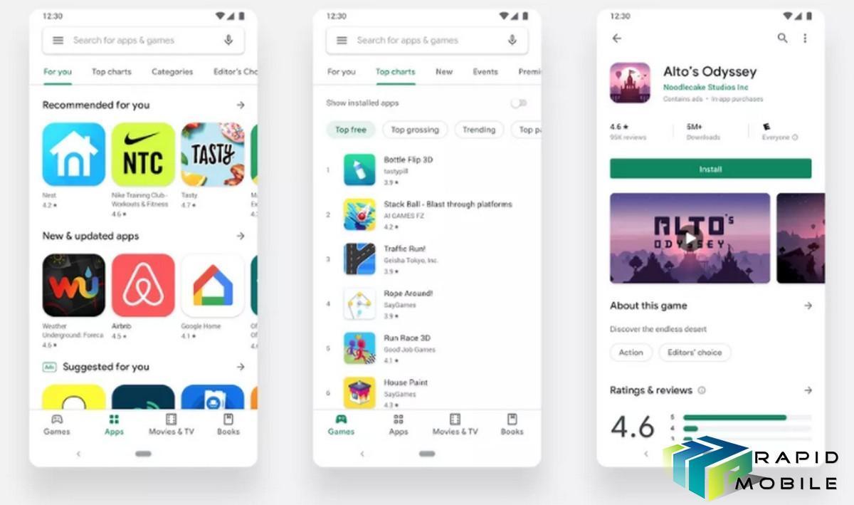
The biggest design change is the positioning of the navigation tabs. Previously, they were located at the top. While phones got bigger over the years, the navigation tabs got harder to use with a single hand.
The new Material Design places the navigation tabs at the bottom of the Play Store on mobile devices, which makes it easier to reach on phones with big screens. However, on tablets, the categories appear on the left in landscape mode.
In contrast, the sub categories are still at the top. Considering they are not used frequently, Google hasn’t re-positioned them.
There are now two distinct destinations for apps and games. Once a user finds the right app or game, the updated store listing page layout surfaces richer app information at the top of each page as well as a more prominent call-to-action button.
Google has also introduced a new icon system with uniform shape to help content stand out more over UI. Other changes include more spaced out elements, increased white space, no segmentation’s between items, and a new typeface (Google Sans), which gives the app overall a fresh and modern look.
Moreover, the Play Store in now primarily white, which makes it bright. However, it can be switched to dark mode using the option in Android 10.
The redesigned Play Store is now available for all Android users.